CREATING AN END-TO-END MOBILE APP
Designing a Mobile App for
Project Overview
Ravelry is a widely-loved platform for fiber arts enthusiasts, offering a robust collection of patterns, yarns, and social features. Nearly 1.3 million patterns are available on the site, and in 2020, there were 1 million active users. However, Ravelry does not have a mobile app; rather, users must rely on the mobile and desktop websites to purchase patterns, access their pattern library, and engage with forums. This lack of a dedicated mobile app presents challenges for users who need access to their patterns and community while on the go.
Timeframe
5 weeks
My Role
UX + UI Design, Research, Prototyping and Testing, Integration of Design with Existing Brand
Tools
Figma, FigJam, Microsoft Teams transcription, ChatGPT, Reddit
The Challenge: translating a desktop website to a mobile app.
Without a native app, Ravelry users have to rely on the mobile and desktop sites for all of their crafting needs. As it stands, the mobile site does not meet the needs of users, who often use the website and craft on-the-go. Users need to be able to:
download and access purchased patterns offline,
browse for new patterns and yarns, and
connect with their fellow Ravelers using Forums.
User Research
Before I began designing, I wanted to hear from real Ravelry users to understand:
What challenges/pain points users currently encounter with the Ravelry mobile website
What features are most important to integrate into the Ravelry app
Real user insights from Reddit shaped the direction of the Ravelry app design.
Some users rely on third-party apps, such as Ravit and Stash2Go, which translate the Ravelry experience to mobile using an API. Some of these apps are free, but others require a subscription or a one-time purchase. These apps have most of Ravelry’s functionality, but can be buggy.
1


There have been issues with Ravelry’s accessibility in the past. The site was redesigned in 2020, and changes, such as low-contrast in the updated color scheme and subtle animations in the screen, made it difficult for many to use the site. Many users left Ravelry and relied on Etsy to purchase patterns and yarns.
2

Example of low contrast on the site.
Because Ravelry offers so many advanced pattern and yarn filters, it can be cumbersome to search for and purchase new patterns and yarns on the mobile site. Users also find it challenging to navigate Forums on the mobile site, which limits their ability to connect with their community.
3
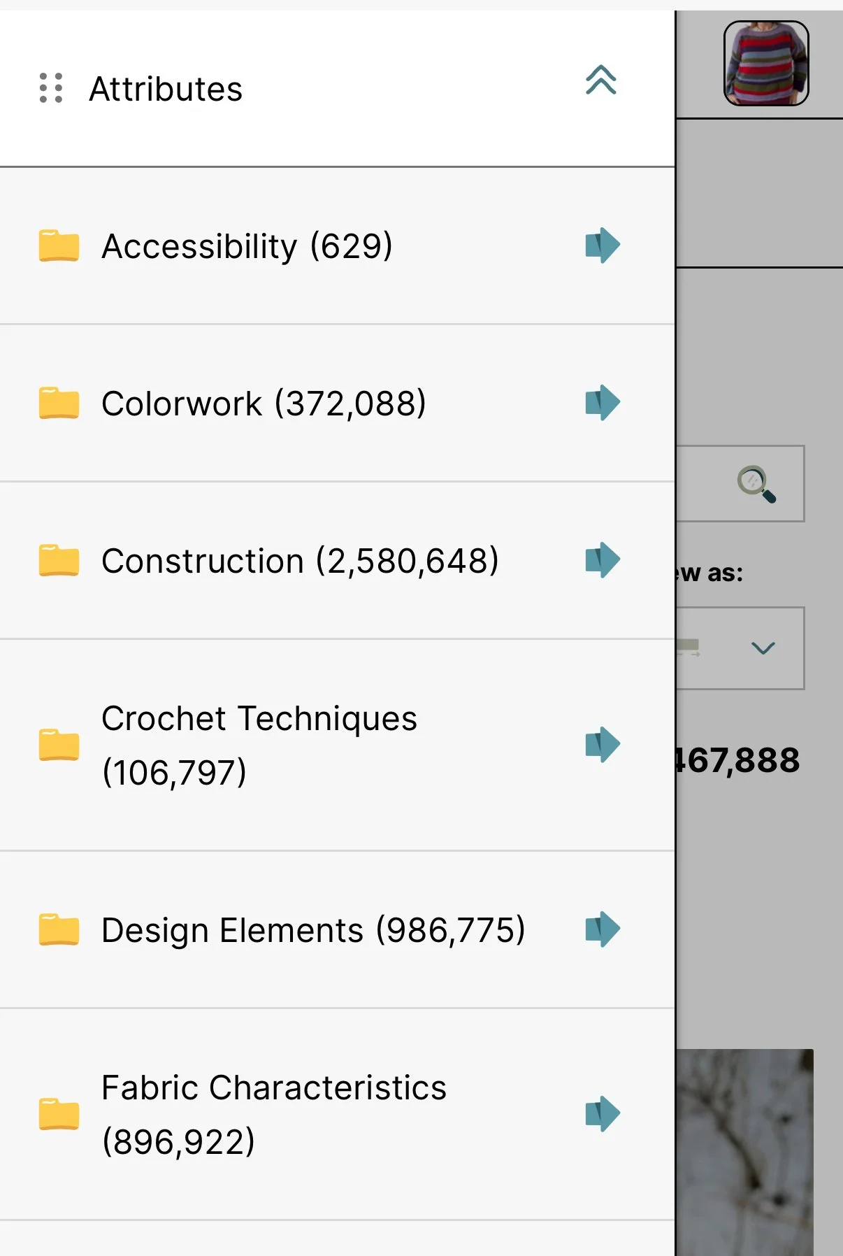
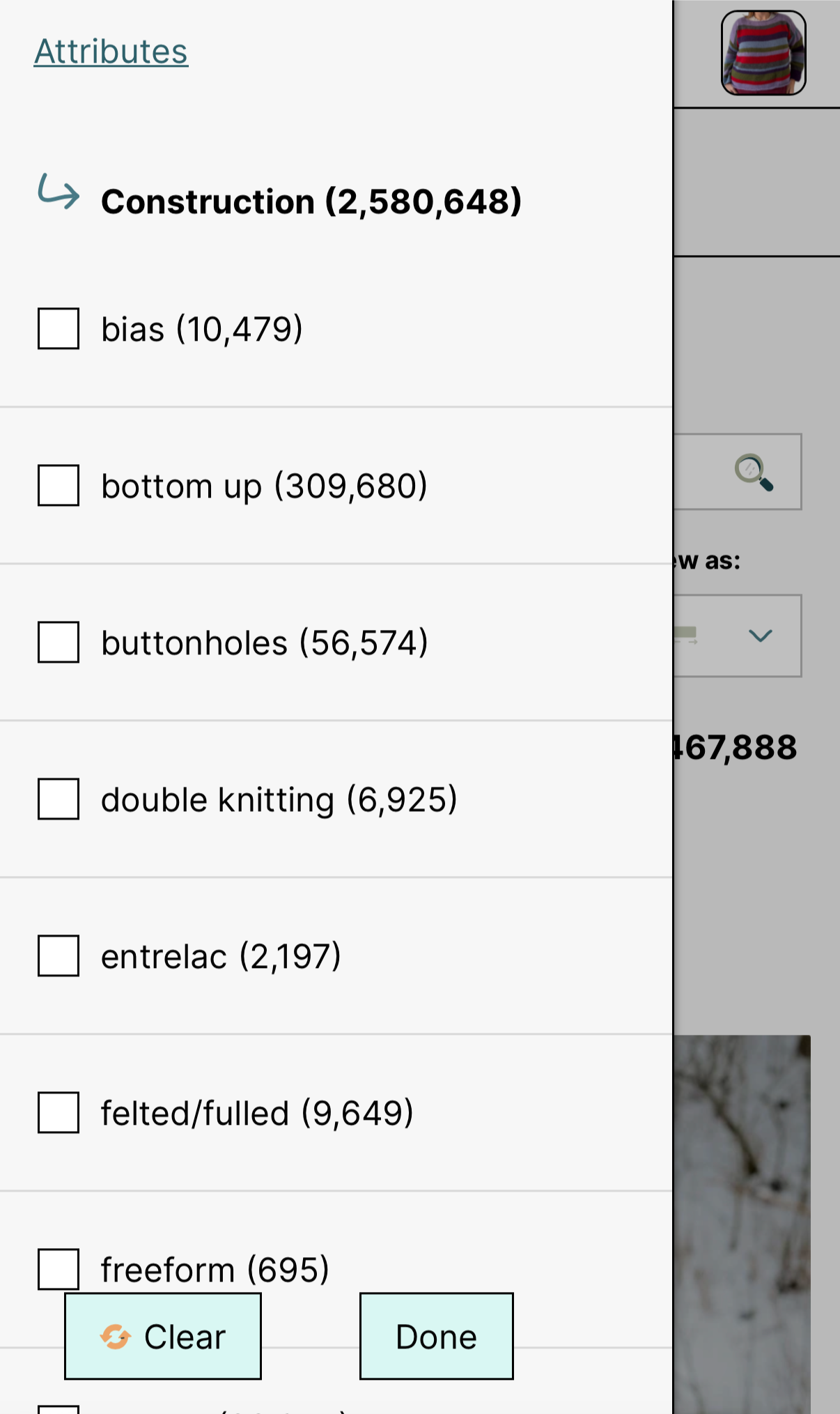
Example of advanced search filters on mobile.
Competitor Analysis
To help ground me in the current landscape of pattern management tools, I examined the current pattern and project management tools offered by Ravelry, kntd: discover, Ravit, and Stash2Go.
Dominates pattern discovery and project management, but an outdated UI and lack of a native mobile app make mobile use difficult.
Ravelry
Offers limited Ravelry functionality via API, but slow performance and missing core features (pattern comments and reviews) reduce usability.
kntd: discover
Most full-featured mobile experience for Ravelry users, but paid access and missing forums frustrate users.
Ravit
Functional companion app for viewing patterns, but premium paywalls and accessibility issues, such as illegible fonts, limit its effectiveness.
Stash2Go

Understanding behavioral archetypes of Ravelry users:
The Browsers and The Project Managers
The Browsers
These users primarily come to Ravelry to discover new patterns and connect with others. They value robust browsing and filtering tools, easy ways to save and purchase patterns, and social features like forums and friend activity. Their experience is driven by inspiration, discovery, and community engagement.
The Project Managers
These users treat Ravelry as a personal project management system. They rely on the app to track project progress, maintain a complete library of purchased patterns, and manage their yarn and tool stash. Accuracy, organization, and long-term record keeping are their top priorities.

Feature priortiziation
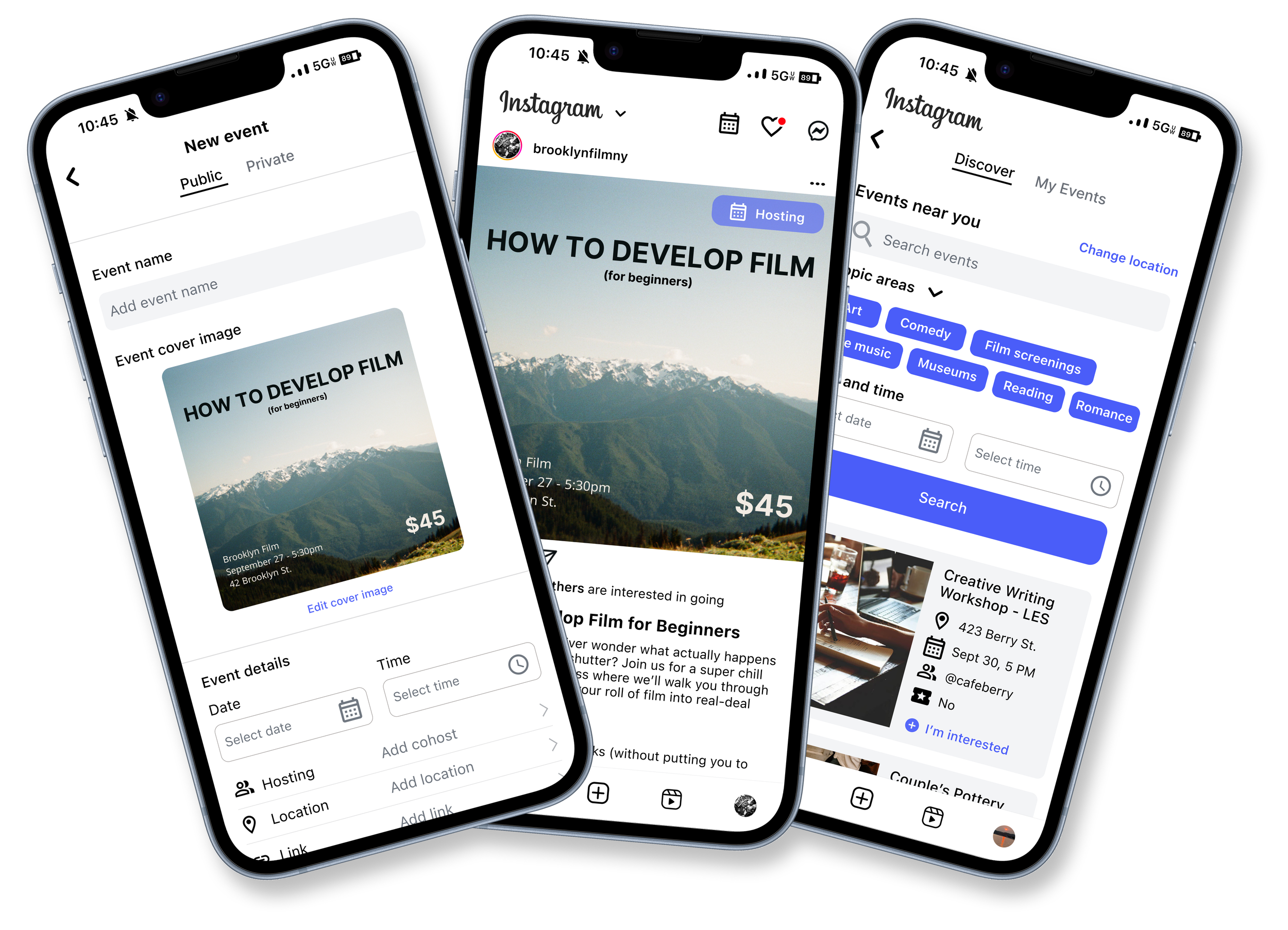
After creating an impact vs. effort matrix of potential solutions, I moved forward with designing the Pattern Library, Advanced Search, and Community Forums, as these are the most critical features for most users of the mobile app.
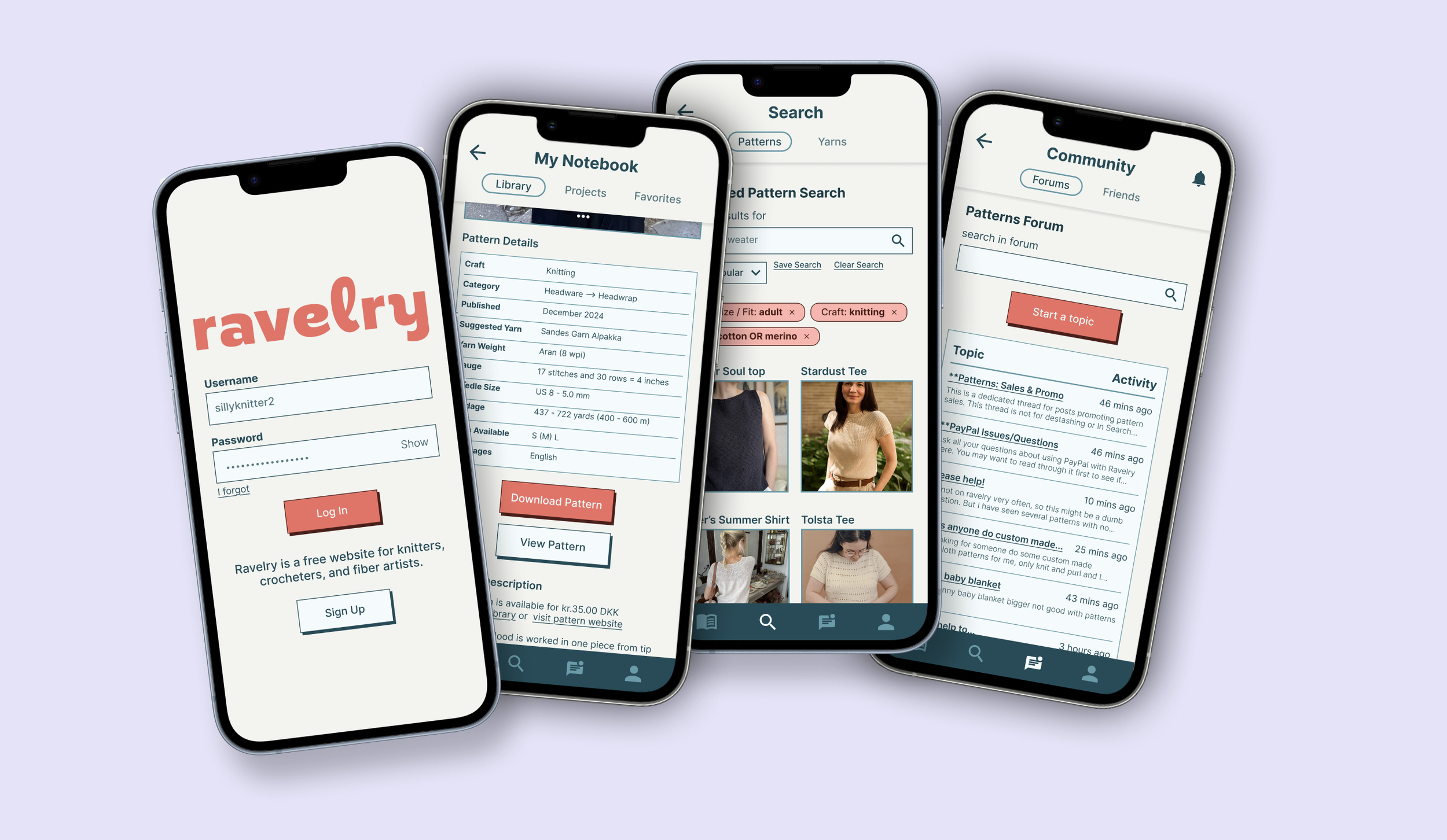
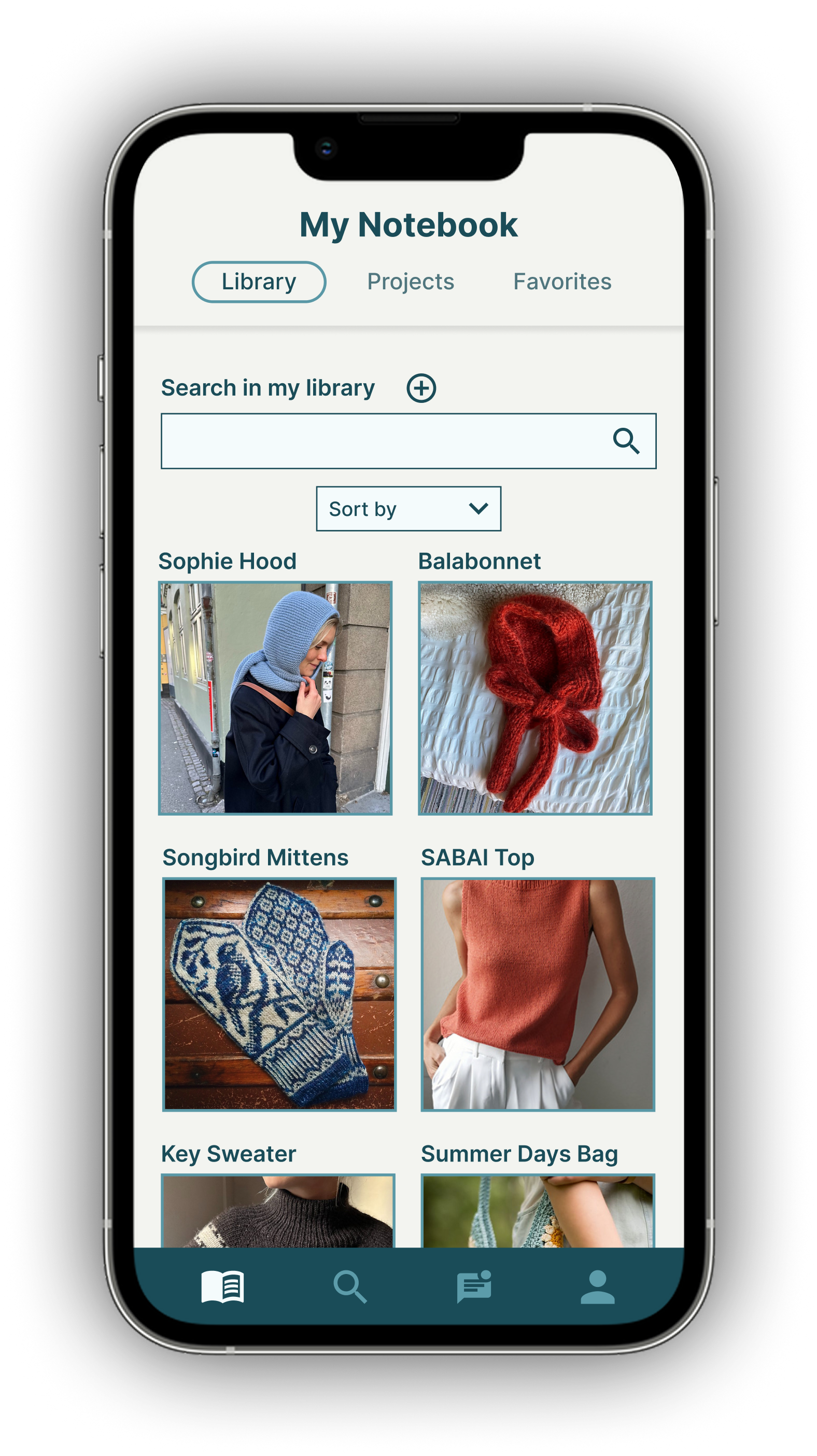
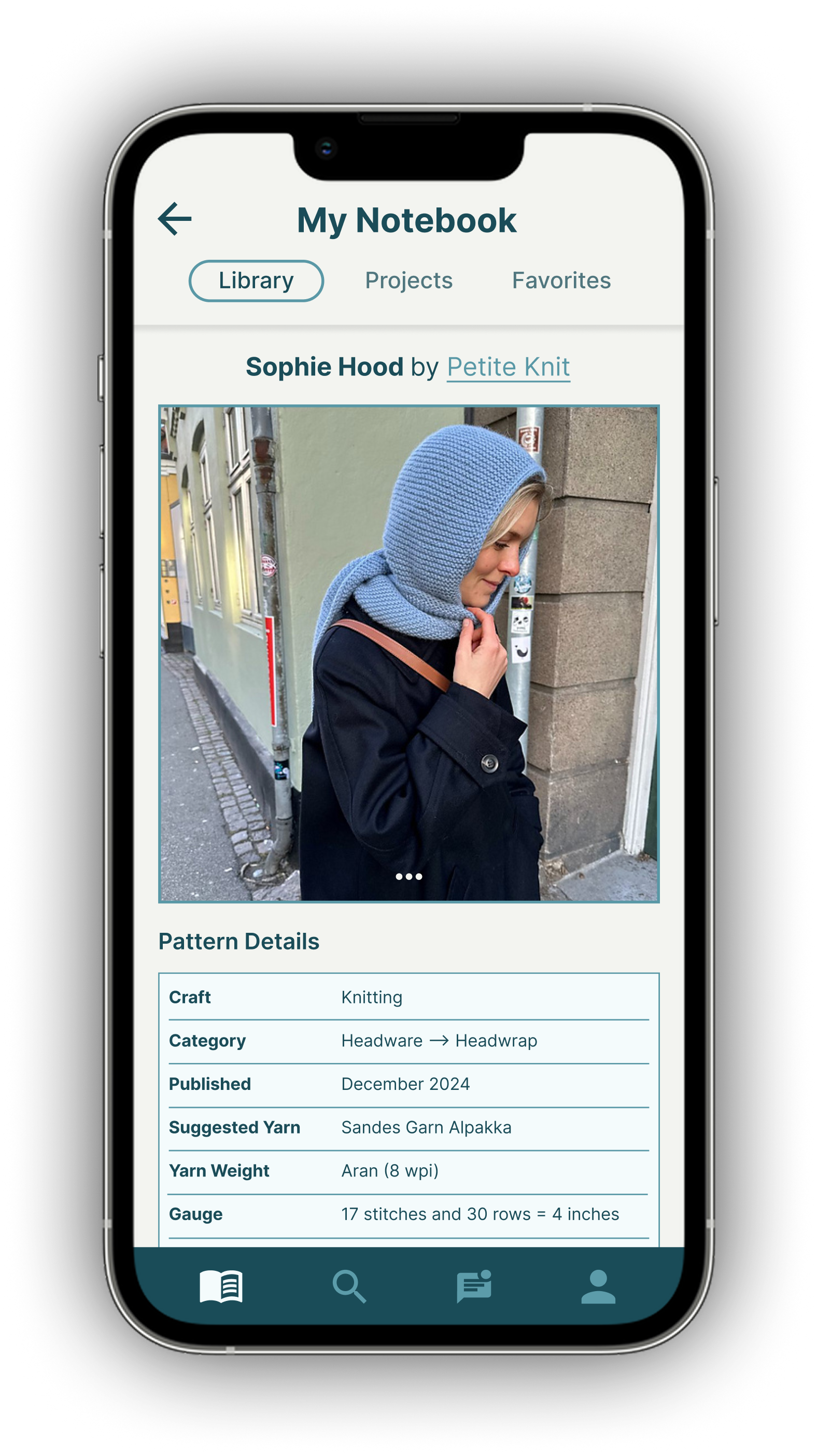
Pattern Library
In the My Notebook tab, users will be able to view their pattern library, update the status of their projects, and access their favorited patterns.
This solution addresses problems highlighted by many users;
It is challenging to access patterns on the go, as there is no centralized place to download patterns.
Project management is difficult on the mobile site.
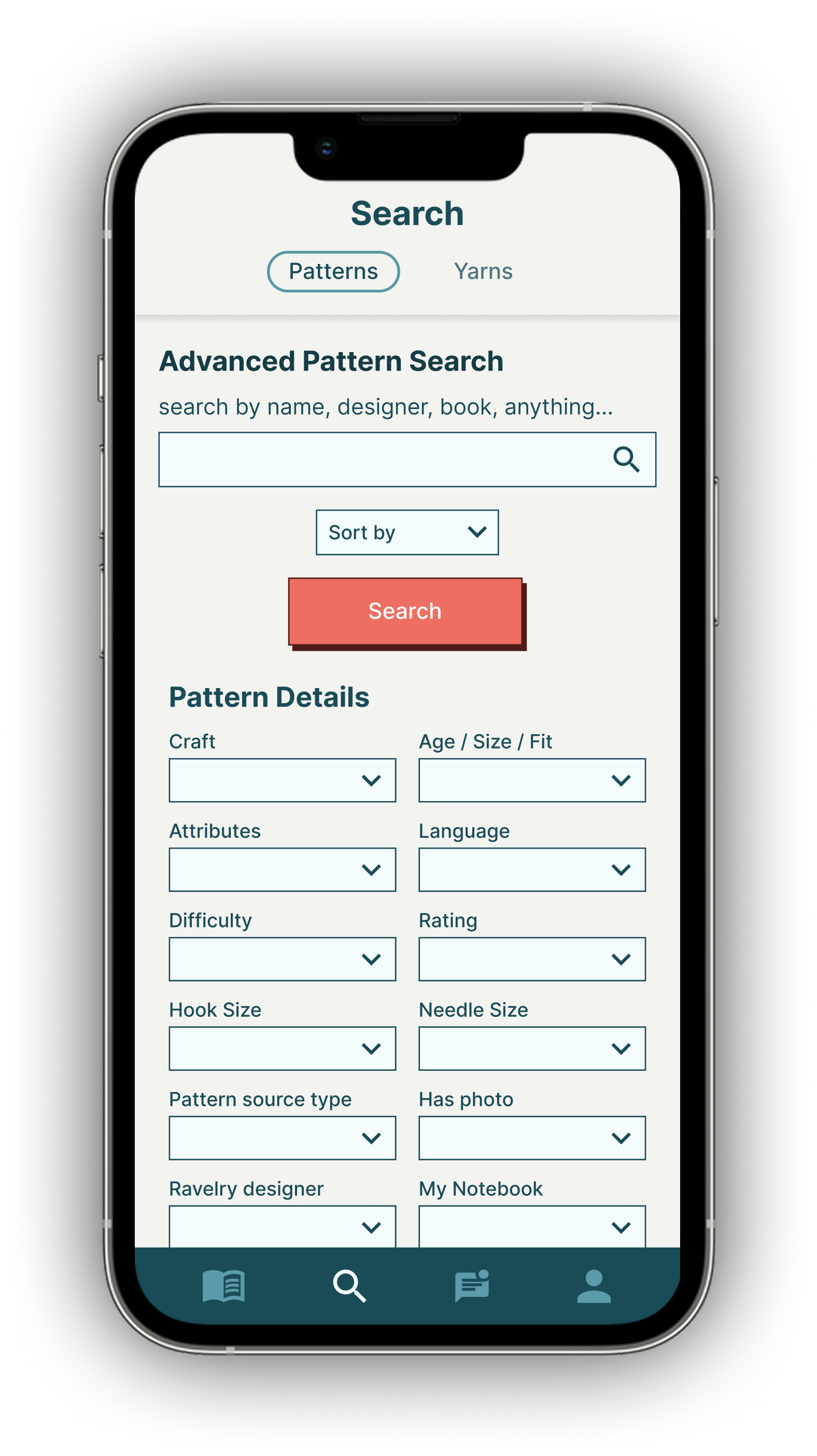
Advanced Pattern and Yarn Search
The Ravelry desktop site’s advanced search filters for patterns and yarns are a favorite feature. In the mobile app, users will be able to toggle between pattern and yarn search and apply advanced filters to find exactly what they need.
This solution addresses user challenges with filters;
It is difficult to navigate the advanced search filters on mobile
Some filters do not appear in the mobile search.
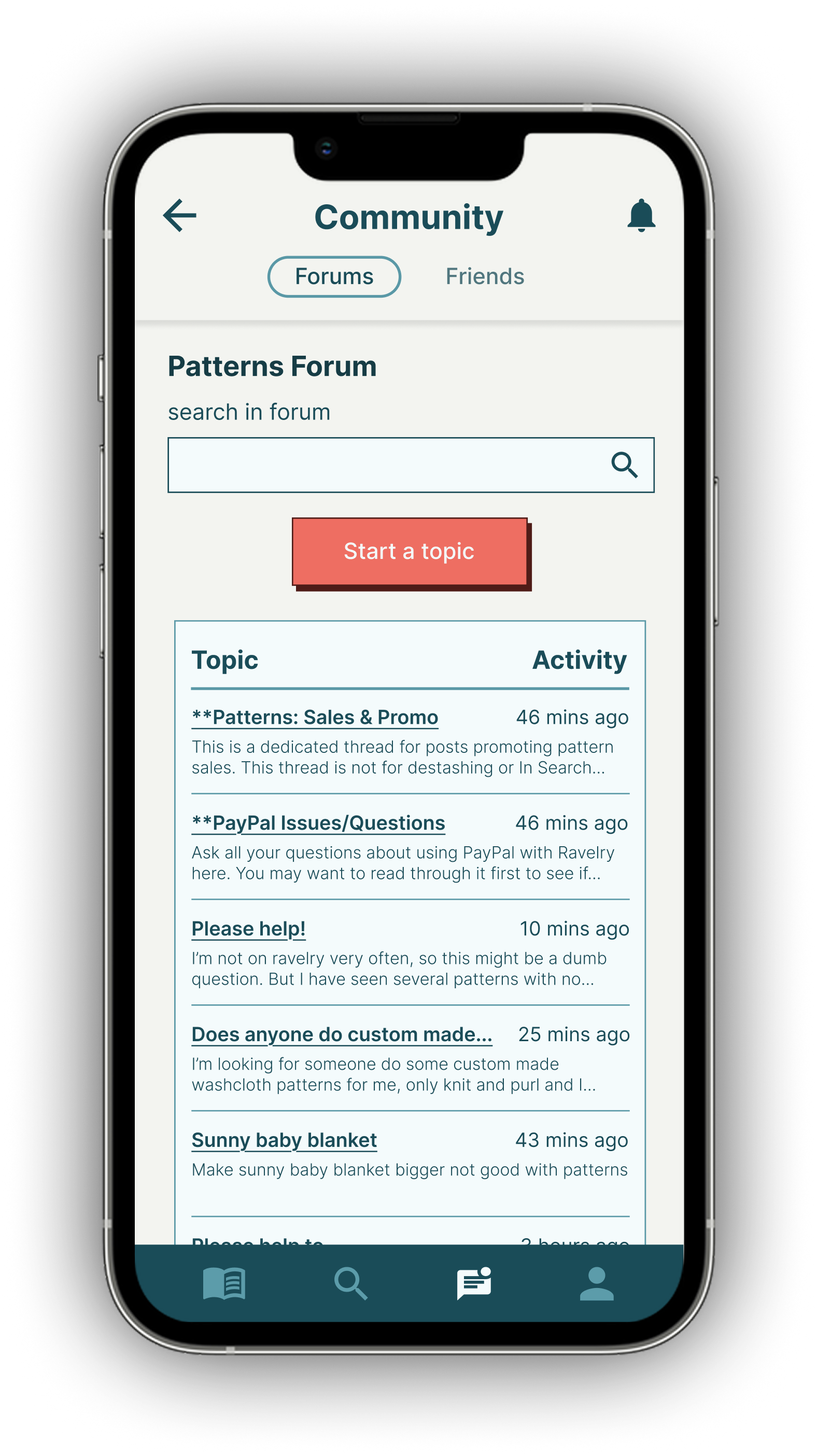
Community Forums
Using the Community tab, users will be able to access the seven primary forums available on Ravelry’s site. Users can ask and answer questions on the go, creating a more active and diverse community of users.
This solution addresses a problem that some users noted;
Forums on the mobile site are frustrating to navigate
Third-party apps often exclude forums entirely.
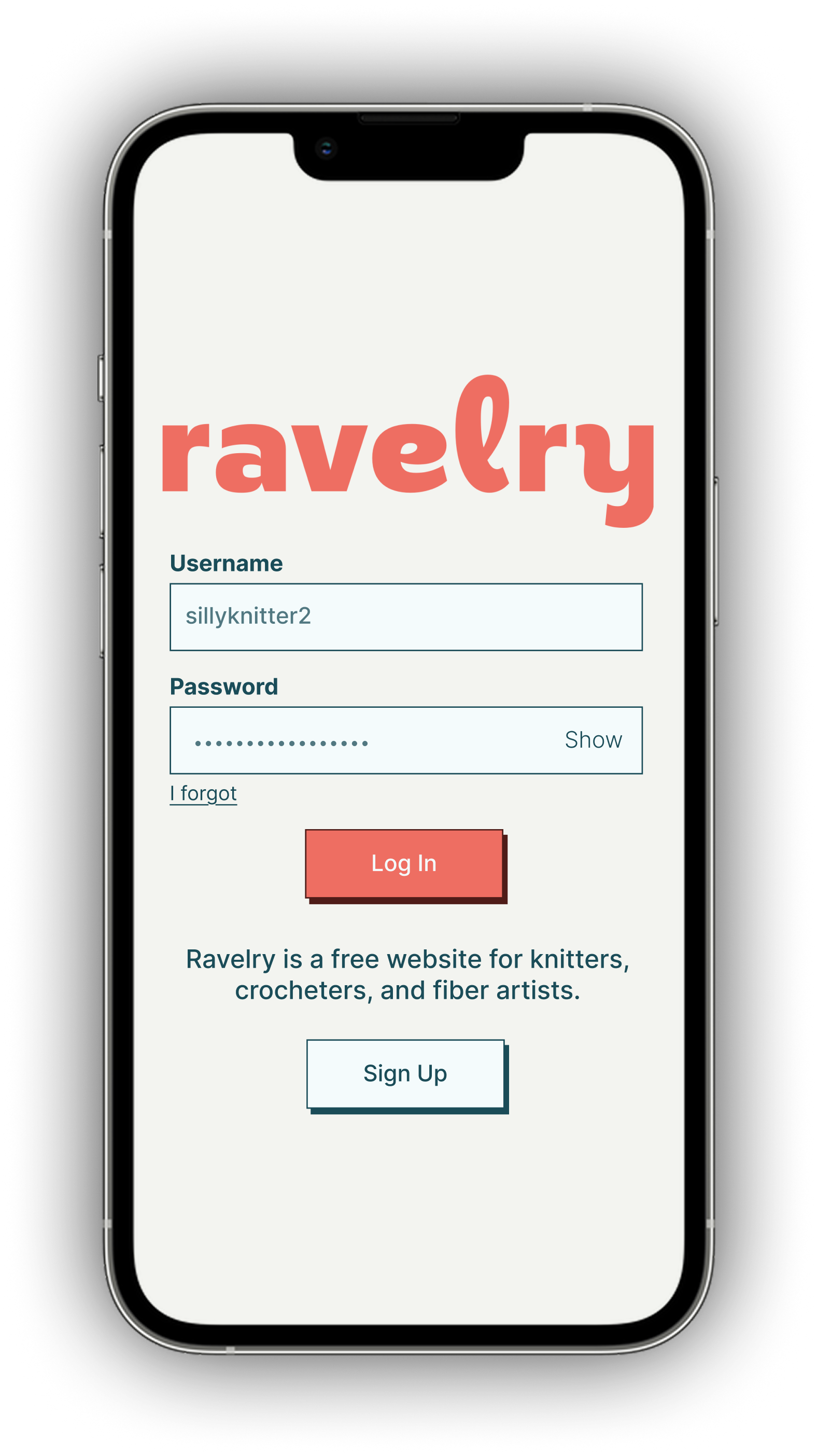
Prototype
Low-Fi Wireframes
I first sketched key screens, playing with different designs while trying to maintain the feel of the existing Ravelry brand, without replicating the accessibility problems with the current site. These low-fidelity wireframes helped me define the key tasks I would ultimately want users to be able to complete in usability testing:
Download a pattern from your library
Search for a pattern using advanced filters
Make a post in a community forum


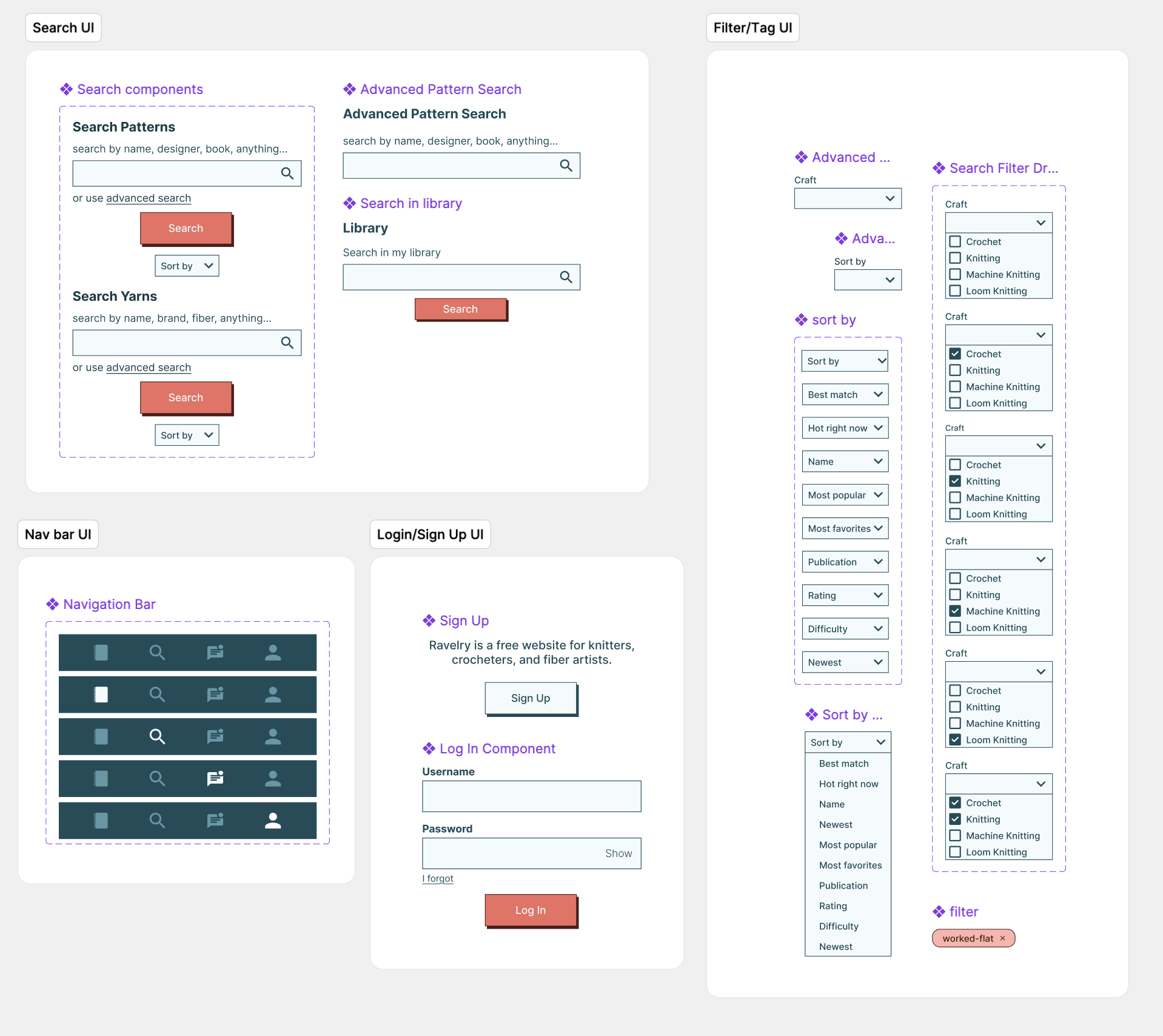
High-Fidelity Wireframes & Prototype
I was working with an existing design system and brand, so I had to make sure that the new mobile app matched the feel of the brand. I spent a lot of time looking at the Ravelry desktop and mobile website and replicated/redesigned key components in Figma, creating a UI kit.
Usability Testing
I spoke with 5 users for this formal usability testing. Four of the 5 users are regular Ravelry users; the other interviewee is an avid knitter who has not used Ravelry before.
Users were asked to complete four tasks using the clickable prototype of my high-fidelity wireframes.
Select the “Sophie Hood” pattern that is housed in your Library. Download the pattern.
1
Use advanced search to search for a new pattern. Use an advanced filter for your search.
2
From the advanced pattern search results, purchase the Summer Soul top pattern.
3
Make a new post in the Patterns forum.
4
While the usability tests demonstrated overall user comprehension of the design, a few areas of improvement emerged.
Provide more feedback when users download a pattern, make a purchase, or publish a forum post.
5/5 users were able to download a pattern, purchase a pattern, and make a forum post. However, 2 users seemed confused afterwards, unsure if they had completed the task as intended, as they were not given feedback.
Sample Hi-Fi Screens
Make advanced search filters more digestible by grouping them into categories.
All 5 users appreciated the advanced search filter options, as this matched their expectations of a Ravelry site. However, 3 of the 5 users noted that the filter options were overwhelming and would prefer to see filters organized by category, rather than alphabetically.
Give users more flexibility by providing back buttons on more of the screens.
There were several instances where a user wanted to go back to the previous page and instead had to restart a task to revisit a page. 5/5 users requested the ability to navigate more seamlessly between pages.
Conclusion
In my personal life, I am a huge knitter, so I was super excited to take on this project. As I began really diving into Ravelry, I realized just how many features live on the site. I knew I would need to narrow down the focus of the app and prioritize the most important and well loved features. After conducting usability testing, I feel confident that I have elevated the right features and made a design that Ravelers of all abilities will want to use.
The final prototypes reflect the needs and wants of Ravelry users. Having a native Ravelry app would allow users to more easily meet their crafting needs on the go. This design allows users to buy and view patterns, while also providing a space for users to connect with and support each other.
This project had a short timeline of just a month, so I wasn’t able to design every feature that I originally wanted to implement. With unlimited time and funds, I would have considered:
Building out the project management pages more, such as allowing users to publish project updates and upload progress photos,
Adding in the yarn stash management page, with potential AI integrations, and
Making the favorites page/allowing users to add patterns to their favorites page.
P.S. If anyone from Ravelry sees this - let me know if you want to collaborate and make this app reality. ☺