RESPONSIVE WEB DESIGN
Creating a Responsive Web Design for

Project Overview
Greenpoint Floral Co. is a florist shop located in Brooklyn, New York. While the current site is functional, it lacks modern design, cohesive branding, and the visual impact needed to stand out in a competitive local market. In this project, I wanted to support the growth of this local business by creating a mobile web design that captures the charm of this shop, while also enabling customers to easily purchase floral designs and plants.
Timeframe
4 weeks
UX + UI Design, Research, Prototyping and Testing, Brand Development
My Role
Tools
Figma, FigJam, Microsoft Teams transcription, ChatGPT
The Goal
Redesign the site with a clear, cohesive brand identity, while also allowing the images of flowers to stand out. Modernize the visual design to be more appealing and engaging, especially to younger users. Improve the site’s usability and make it easier for customers to navigate, browse offerings, and place orders confidently.
User Research
Before I began designing, I interviewed five users who have purchased flowers online to learn:
What expectations, behaviors, and preferences they have when purchasing flowers online.
What challenges they have faced in the past when purchasing flowers.
What they think of the current Greenpoint Floral Co. site and where I should target my design improvements.
An outdated, unclear website makes users doubt bouquet quality and delivery reliability.
Most users purchase flowers online when they are having them delivered to someone they do not live near. Users expressed concerns that the quality and size of bouquets pictured on the website will not match what is delivered. It is important that a florists’ website provides users with a sense of trust. When a website looks outdated, users do not trust that they will deliver quality florals.
1
Users found the current Greenpoint Floral Co. website to be visually outdated, while also lacking a clear visual hierarchy. For example, on the home page, users wondered why the two bouquets on the right were highlighted. Are they bestsellers, new offerings, or randomly highlighted? The logo used in the top left corner is also concerning, as the color contrast does not meet current accessibility standards.
2

Example of unclear visual hierarchy and limited color contrast
Users were unable to locate delivery information, as this was buried in the footer under “Safe Shopping” and in the header under “Help.” Once users found this information, they had a hard time finding key delivery details, as the lists of funeral homes and other delivery sites were not organized alphabetically or by borough.
3


Sample of delivery information provided by the shop

Understanding behavioral archetypes of customers:
The Occasion-Based Shoppers & The Event Planners
The Occasion-Based Shopper
These users primarily purchase flowers to be delivered to friends, family, or colleagues for specific occasions. They value clear pricing, accurate bouquet imagery, and easily accessible delivery information to feel confident that what’s delivered will match expectations. Outdated design, hidden fees, or unclear sizing quickly erode trust and can cause them to abandon a purchase.
The Event Planners
These users sources florals as part of a larger event experience, such as parties, weddings, or corporate gatherings. They expect modern design, high-quality imagery, and clear size and style indicators that allow them to quickly assess fit without excessive clicks. Poor organization, cluttered layouts, or unclear product categorization create friction and undermine confidence in the florist’s professionalism.

Feature prioritization
After creating an impact vs. effort matrix of potential solutions, I moved forward with designing the browse by occasion results page, checkout flow, and delivery information tab, as these were mentioned most frequently by users.
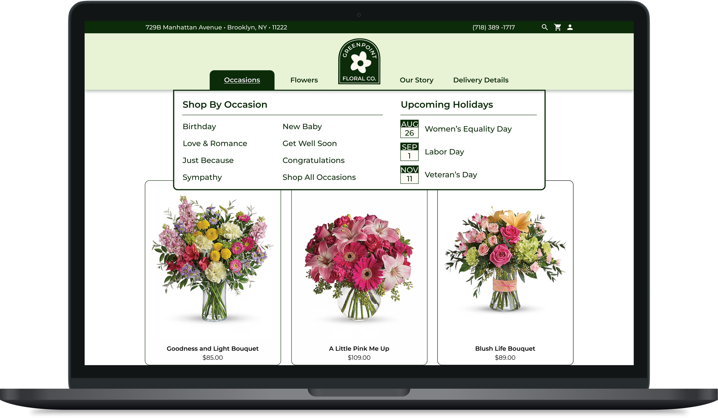
Browse by occasion
User interviews revealed that browsing by occasion is essential; all participants reported shopping by occasion when purchasing flowers online.
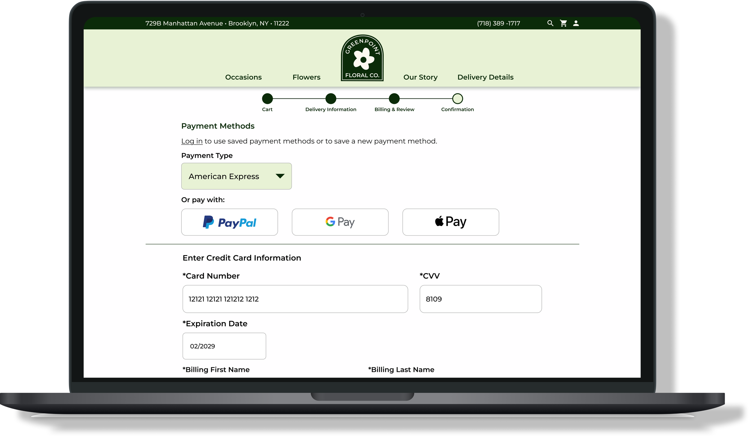
Checkout flow
The checkout flow is the most critical part of the website. Users need to move seamlessly from browsing to purchasing, and a clear, low-friction experience will help increase conversions.
Delivery information
Delivery information is currently difficult to find, despite being a key decision factor. Since many customers are not local, this information should be surfaced prominently to support purchase decisions.
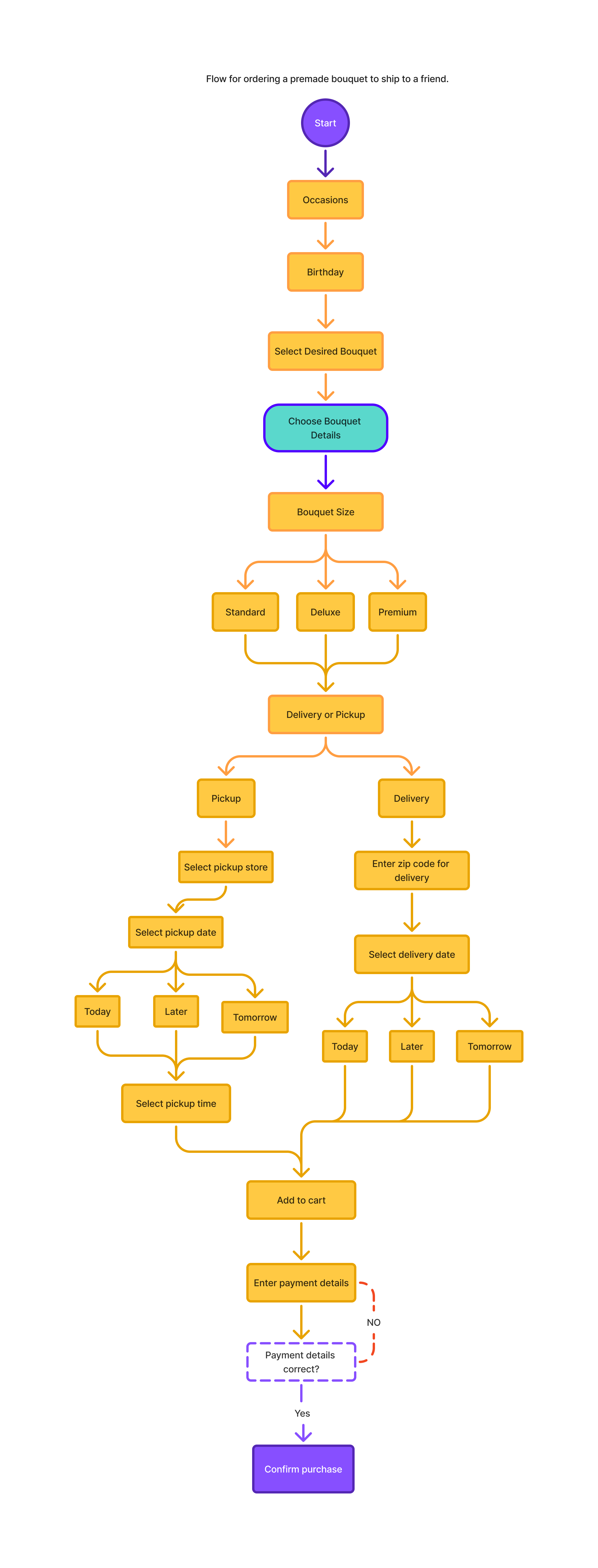
User Flow
I created a user flow to help me understand how users would complete the primary task of ordering flowers to be delivered to a friend for their birthday. For this task, users must take actions like:
Browsing for and selecting a bouquet
Selecting the bouquet size and price
Entering the delivery zip code and selecting a delivery date
Completing the recipient information and credit card payment forms.
Creating these flows provided me with an understanding of what screens I would need to develop in wireframing, while also encouraging to think more about which features were absolutely necessary for the MVP.
Low-Fi Wireframes
I first sketched key screens, playing with different designs while trying to find places where I could improve existing screens (rather than redesigning from scratch). These low-fidelity wireframes helped me define the key tasks I would ultimately want users to be able to complete in usability testing:
Shop by occasion
Browse bouquet options using filters and price/popularity based sorting
Select the size and delivery information for a chosen bouquet


Logo & Brand Design
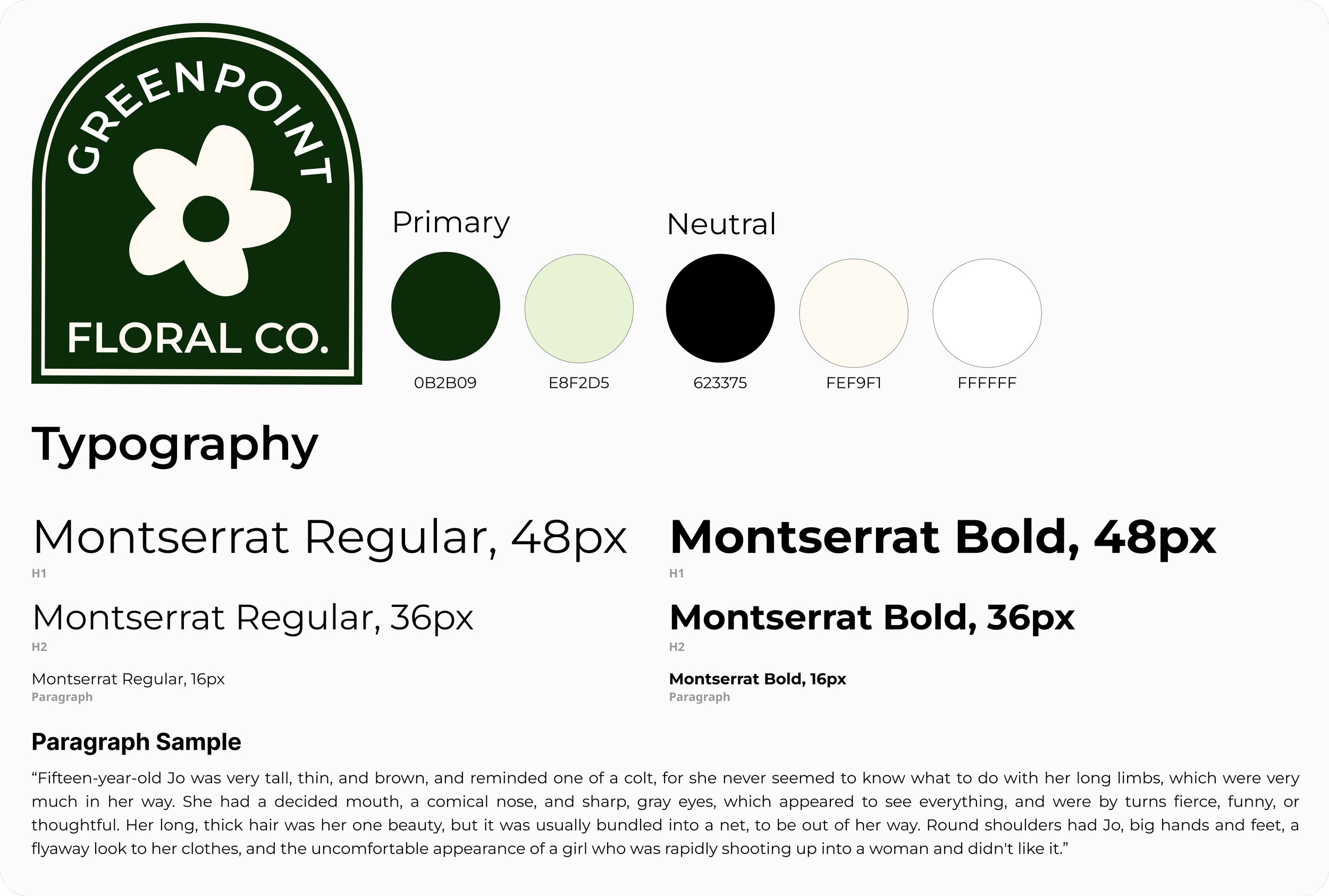
In this project, I was redesigning the brand as I redesigned the site. I experimented with several logo and color scheme options before leaning into the green shades used by the existing site. I wanted the logo to be simple but impactful, so I created a design with a limited color scheme and form.
Usability Testing
I interviewed four users for this formal usability testing. All four users have purchased flowers online, and three of the four users were participants in initial user interviews. This was helpful, as these users often directly compared features of the redesign to the original site they saw earlier in the month.
Users were asked to complete three using the clickable prototype of my high-fidelity wireframes.
Select a birthday bouquet to be delivered to a friend. Use filters and sorting when browsing.
1
Order a bouquet for delivery and complete the checkout process in its entirety.
2
Locate the locations where the florist shop delivers locally.
3
“The order process feels straightforward.”
“It was easy to find the birthday bouquets!”
“Alphabetizing the delivery list makes it much easier.”
While the usability tests demonstrated overall user comprehension of the design, a few areas of improvement emerged.
Users noted excessive scrolling was needed when going through the purchase flow. Font and button sizes were too large.
4/4 users were able to successfully complete a purchase. However, 3 users noted that the spacing between lines and font sizes could be reduced to limit the amount of scrolling needed to get from the top to the bottom of each form.
Users encountered a glitch in the prototype which brought them back to the top of the page in the middle of form screens.
All users were able to find the delivery locations and complete a purchase. However, as they interacted with the prototype, users were often brought back to the top of the next screen, rather than to the previous scroll location. This issue was with the prototype, not design, but still hindered users’ ability to immerse themselves in the design.
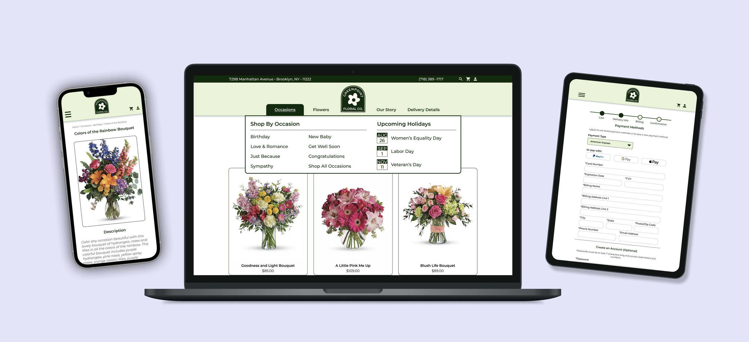
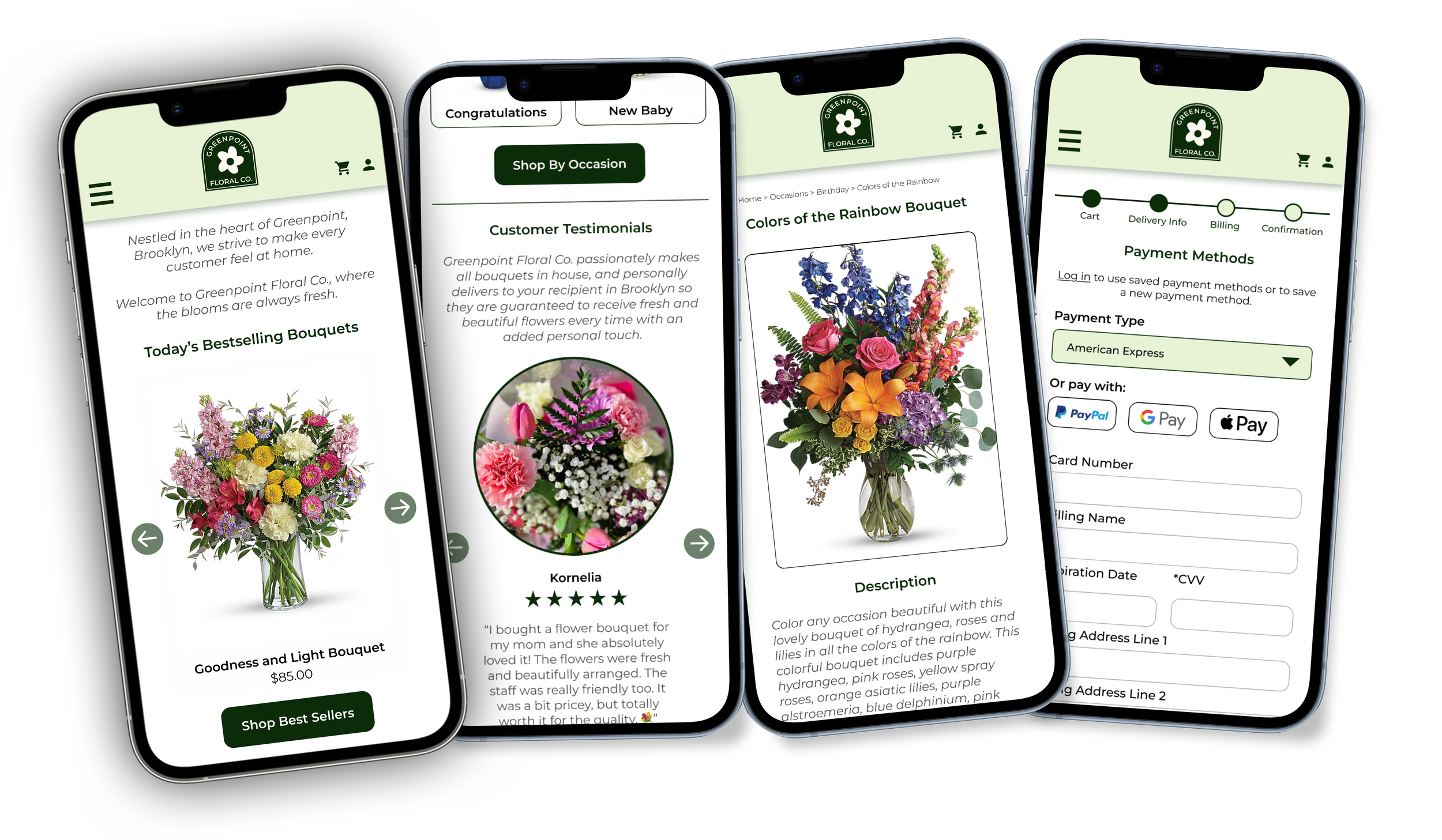
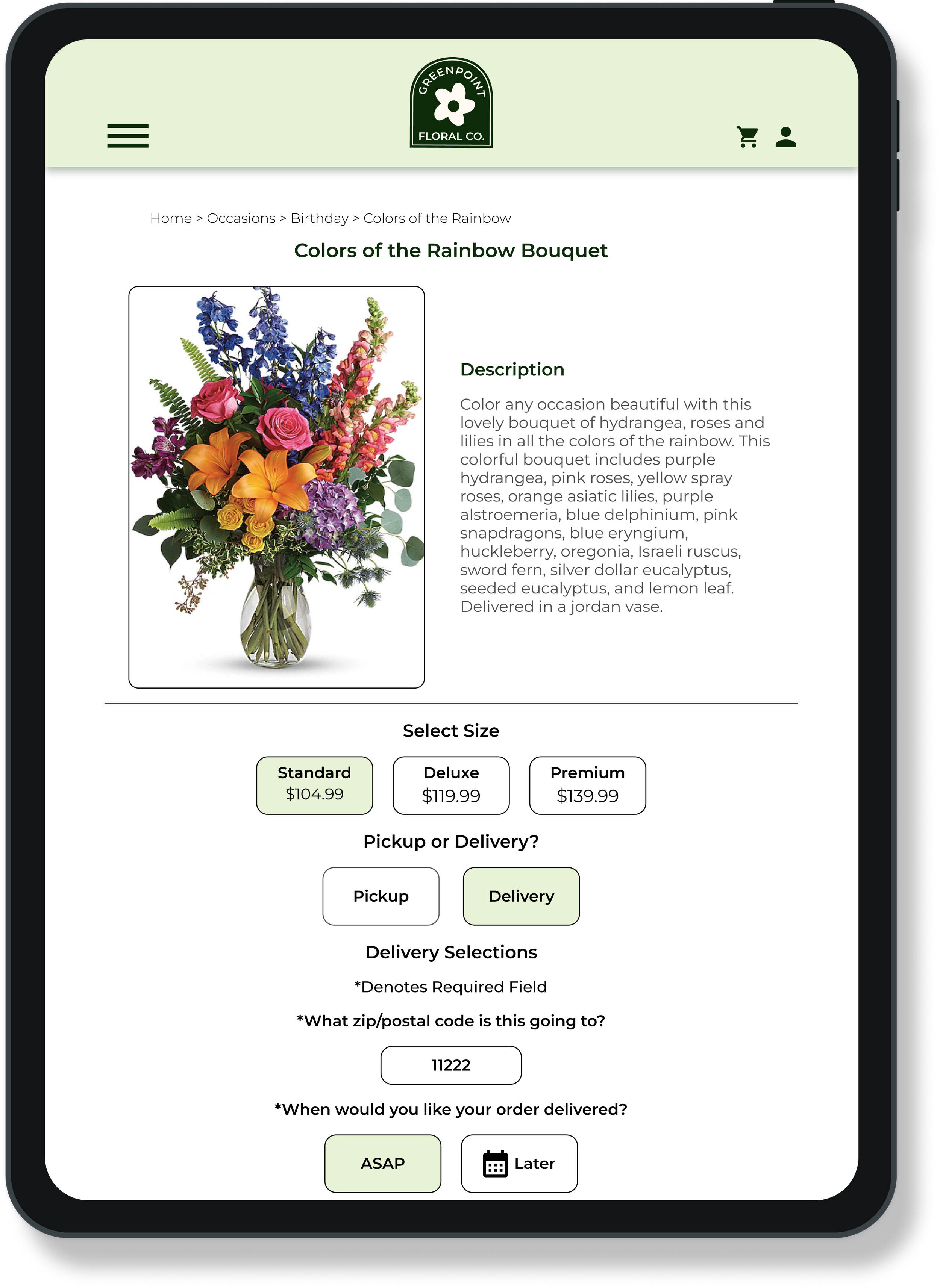
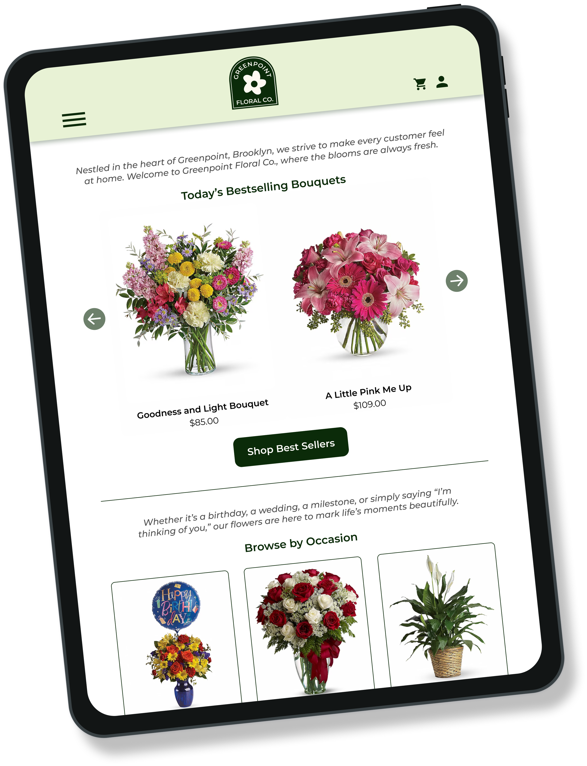
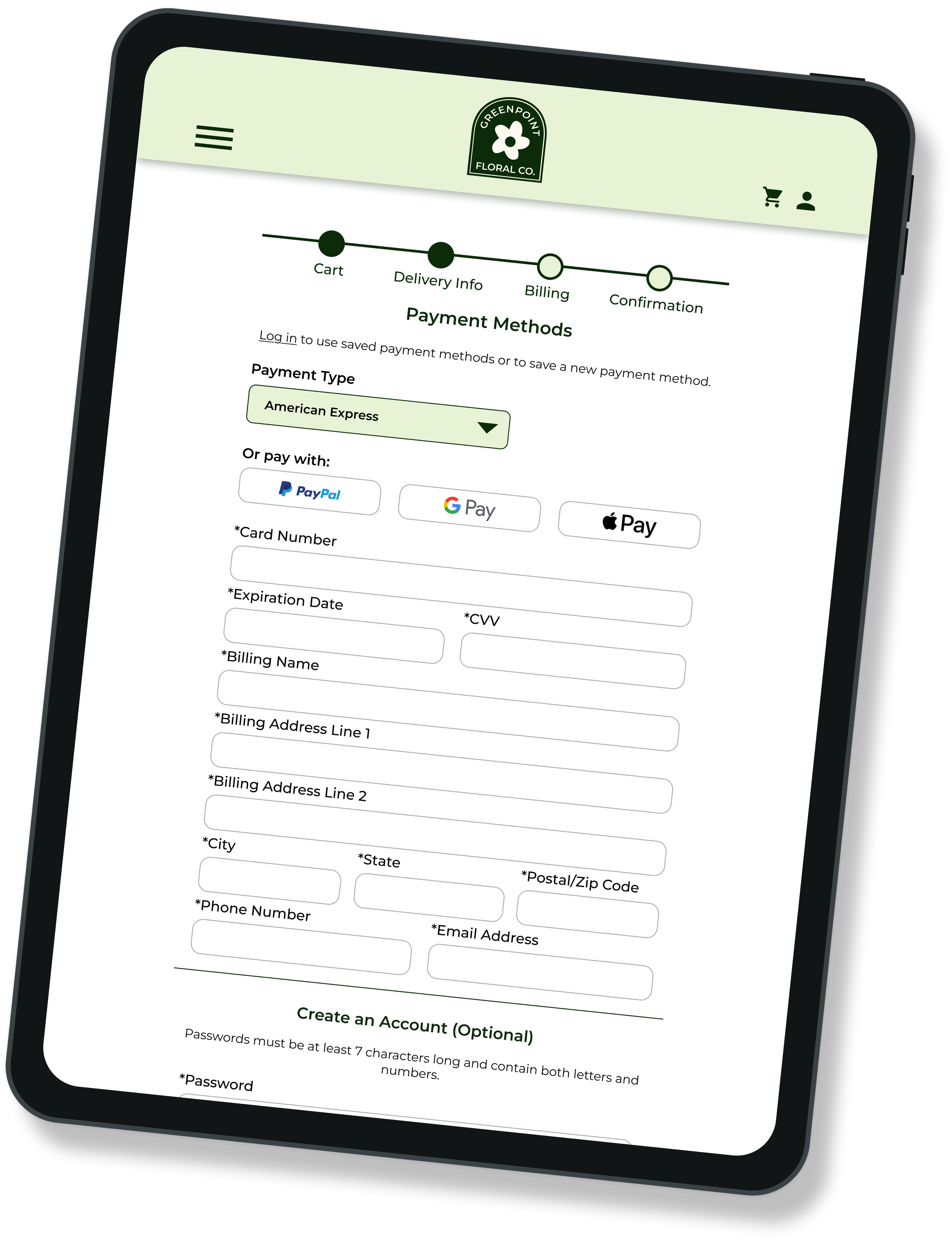
Responsive Designs
A key component of this project was the creation of responsive web pages across desktop, mobile, and tablet devices. I focused on a few key screens for the responsive design:
Home page with bestsellers, occasions, and reviews highlighted
“Colors of the Rainbow” bouquet shopping page
Credit card/billing information page
Conclusion
I chose this project because I’m particularly interested in website redesign and brand development. Greenpoint Floral Co. offers beautifully arranged, well-photographed florals, but their website didn’t reflect that same care or character. Through this new design, customers will be able to more easily navigate the site, hopefully leading to increased sales and more repeat buyers.
This project had a short timeline of just a month, so I wasn’t able to design every area of the site that I originally wanted to. With unlimited time and funds, I would have considered:
Developing a wedding florals consultation form and page,
Fully designing the checkout flow for pickup,
Creating a custom bouquet feature or opportunities for customers to change parts of premade bouquets.